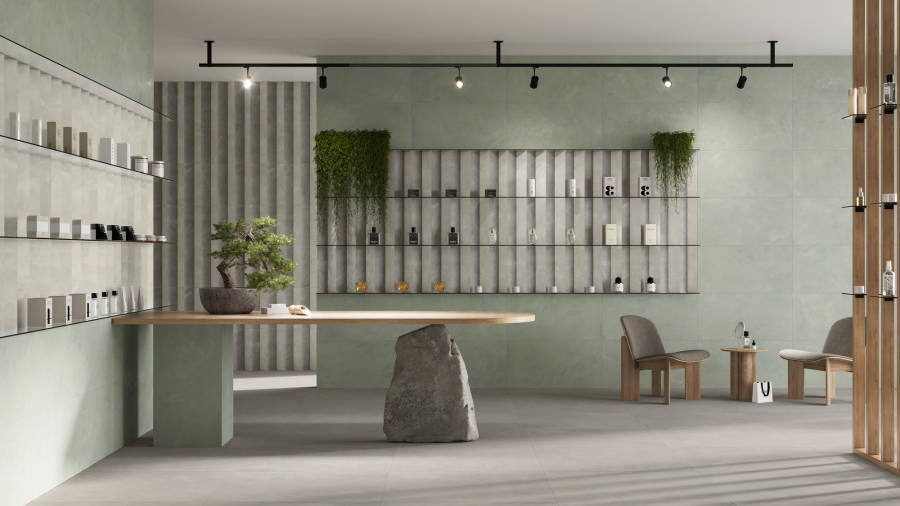
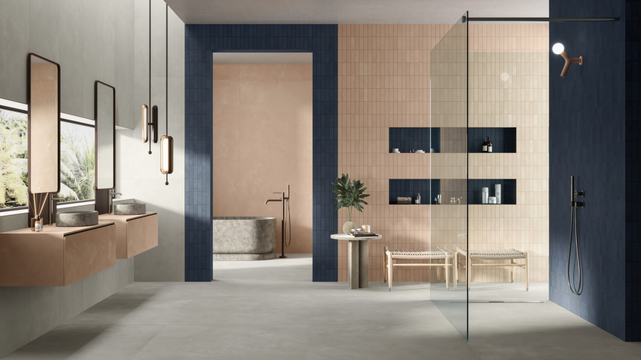
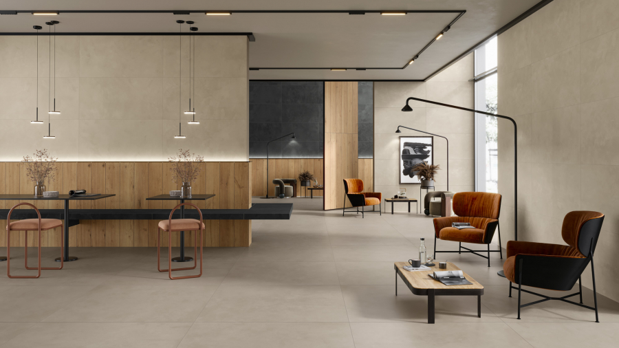
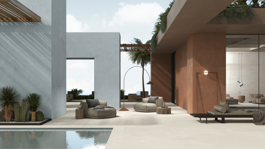
For the last 20 years, the announcement of the colour of the year has been one of the most hotly anticipated moments in the calendar for designers and aficionados of style and design. The colour of year can be used as part of interior design projects to showcase their ability to reflect the latest sociological trends, or be incorporated into the home via smaller objects which keep our private spaces in sync with developing styles.
Since 2000, the company responsible for selecting the colour of the year has been Pantone, the US market leader in colour cataloguing and the inventor of the eponymous colour identification system.
Classic Blue: blue becomes the hottest trend in interior design
Classic Blue has been chosen as the most representative colour of the trends of 2020. It’s a simple, elegant colour which conveys a sense of tranquillity and harmony. These reassuring qualities were at the heart of the reason why Pantone opted for Classic Blue, with the company explaining that the shade “reveals our desire for a stable base upon which to build as we prepare to cross the threshold into a new era”.
Pantone also stressed that Classic Blue facilitates concentration, encourages reflection and promotes resilience - all factors that must always be kept in mind when it comes to designing domestic spaces.
Caesar has always been a champion of the colour blue. It’s no coincidence, for example, that our logo features the colour, in Pantone 282 C - a deeper shade than Classic Blue, but one chosen to underline the reliability, solidity and stability of the solutions we offer.
Caesar’s shades of blue: ahead of the curve
Getting ahead of the curve is vital in the field of design. Thanks to the tireless work of our product development department, Caesar has shown itself to be at the forefront of this new trend, with releases in the last two years including ceramic slabs capable of showcasing the virtues of blue through an original approach to the material.
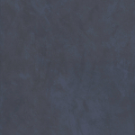
The closest blue to Classic Blue in the Caesar range is the most recent shade to be added: Ink. A dark, elegant and non-intrusive shade of blue, it forms part of the Join collection (launched at Cersaie 2019), which combines the modernity of cement with the elegance of resin.

There are several shades of blue available in the Relate collection, an original ceramic design whose Flame version evokes the effects of burning and oxidation on materials. In this collection, which was launched at Cersaie 2018, blue is present in three unique varieties.
There are the dark shades of Tide, where dark grey is infused with hues of deep blue, while Blaze alternates light blue with areas ranging from yellow to copper and Reef uses deep ocean blue mixed with traces of dark copper to recreate the appearance of a starlit panorama, conveying the same concept of the vast sky that Pantone identified in Classic Blue.
There are several shades of blue available in the Relate collection, an original ceramic design whose Flame version evokes the effects of burning and oxidation on materials. In this collection, which was launched at Cersaie 2018, blue is present in three unique varieties. There are the dark shades of Tide, where dark grey is infused with hues of deep blue, while Blaze alternates light blue with areas ranging from yellow to copper and Reef uses deep ocean blue mixed with traces of dark copper to recreate the appearance of a starlit panorama, conveying the same concept of the vast sky that Pantone identified in Classic Blue.
| |  | |
The Layers ceramic collection, meanwhile, creates a bridge between the worlds of fashion and interior design. The ethos is based around the idea of creating one product that looks like a combination of lots of different layers, making it hard to distinguish the borders. In the Trend colour, this feature is combined with a blue accent that - thanks also to the many complementing decorative elements - manages to bring originality and harmony to any interior design project.


